Wednesday, 7 March 2012

Television magazine front cover


To make my television magazine front cover as realistic looking as possible I ensured that I used all the typical conventions such as; the masthead in a bold red to allow the reader to easily see the title of the magazine, the dominant image to attract their interest and strap lines to give more information and an insight into what is inside the magazine.

For my title I used a free online text generator, in order to make it both visually interesting and stand out, attracting a potential buyers attention.  I chose a bold, rounded font, to give my magazine an appropriate fun, entertaining look, instead of a more serious broadsheet approach which would appeal to the wrong target audience.

I chose to use a light blue colour for the background of my cover as not to detract any attention away from the photographs and text.  This also made it easier for the masthead and other text to stand out.

The main image is a photograph of two characters from my soap trailer.  I chose to use the young mum and baby as I felt that this was one of the most controversial topics within the trailer due to young mums always being looked down on and never seen as good enough.  However the fact that the title states 'Amanda wants a better life for her and baby Charlie' shows that this stereotypically negative view is challenged as it appears as though she is aware her sons life but is now trying to do the best for him.  This will hopefully attract the audience into wanting to know more about the past, as well as the need to find out whether there is a positive outcome in their future.

I also included a bar code, date and website address to add to the realism, as well as advertising other programmes and a competition, both attracting potential buyers to my magazine over other competitors.

Monday, 5 March 2012

Poster background locations

I copied my character onto a variety of different location photos in order to decide which one looked best and reflected the mood and situation of the character.


I finally came to the conclusion that they were all too brightly lit and, as I wanted to project the isolated mood of the character, continued to search through photos we had taken, whilst on location, for another which I felt was more suited.

My soap posters

After finding some darker looking background photos I created a few different versions of my poster as I was still unsure on what photo to use.


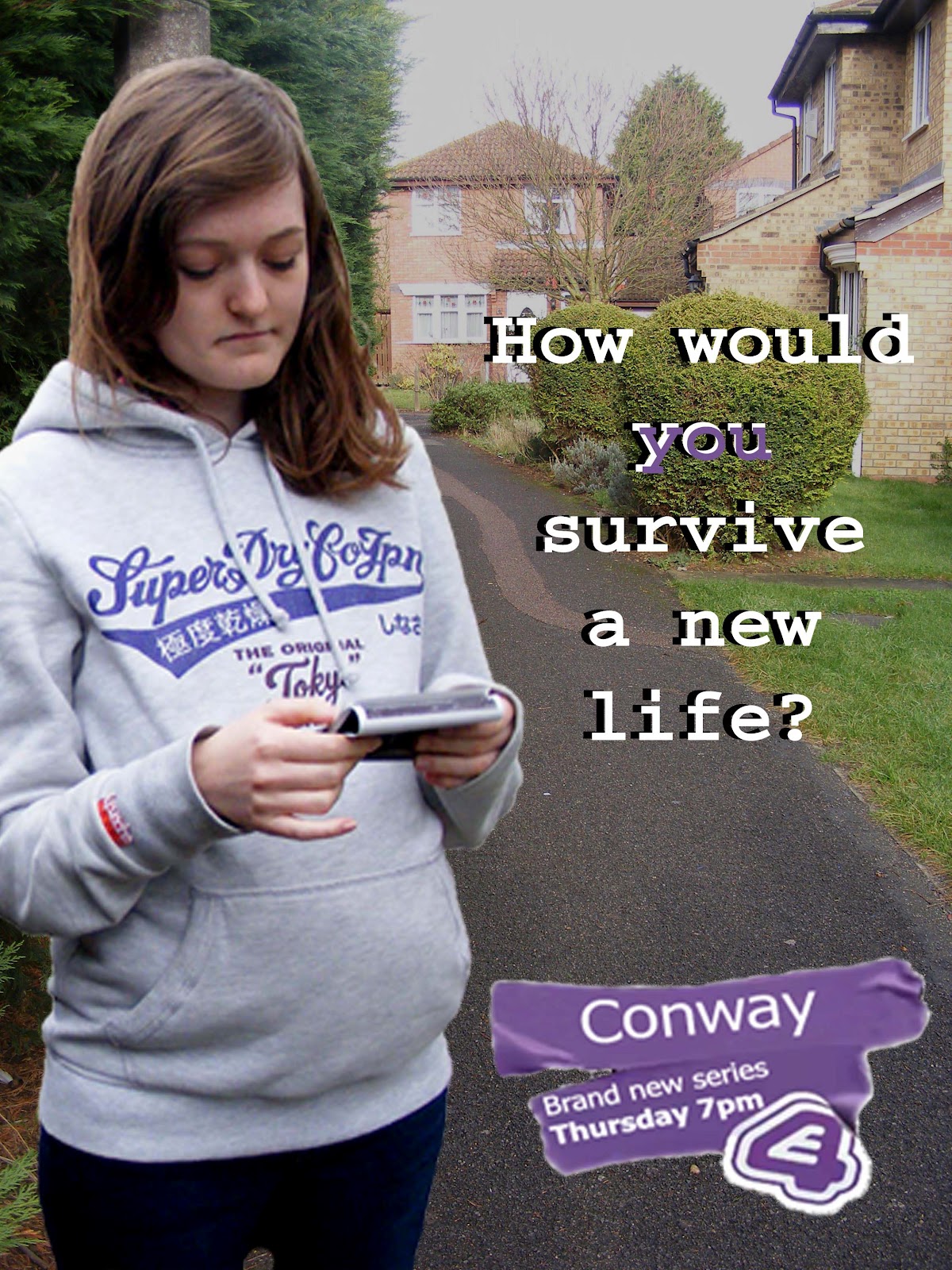
I decided on a photo which was taken around the area where the characters scene was originally shot as.  This was because, although it wasn't as dark and gloomy as some of the others, it made it clear that the soap is set in a small town, as she is standing down an alley way with houses behind.


Thursday, 16 February 2012

Drawn plan of soap poster

I made a quick rough sketch of where I wanted everything to be, and what needed to be, on my poster.
  • Title - Conway
  • Tagline - How would you survive a new life?
  • Date and time -Thursday 7pm
  • Channel logo - E4
  • Character/s -Pregnant teenage girl (and?)
  • Official website address -for added information
  • The word 'new' -to inform entice the audience

Research: Soap posters

Soap posters are there to inform the public of a completely brand new or new series, giving them the time, date and channel but also an small insight into what it will be like using characters and mise en scene.  The information is kept short and simple, as posters are viewed quickly and the images 


This poster in particular is almost highlighting to the public the fact that Hollyoaks is different to a typically conventional soap, with clubs instead of pubs, aiming to target a younger audience.  The characters are young and glamorous looking in the right image, unlike the left.


Although skins is a drama, not a soap, its posters are good examples as they are aimed at the target audience which our soap is aimed at.  Both posters are about partying, mischief and having fun, representing a typical teenagers life.

Saturday, 28 January 2012

Improvements made after feedback

  • Cut beginning of music, started too slowly, needed to have more pace.
  • Made the text bigger so that it was more visible.
  • Made it shorter and choppier, adding pace.
  • Moved the speech of 'black haired girl' to make seem more realistic.
  • Finished end title.

Friday, 27 January 2012

Audience feedback from first draft

As an effective way of gathering feedback from our target audience we uploaded our first draft of our trailer onto a web 2.0 site, YouTube, then shared the link on our Facebook profiles.  This meant that, on YouTube, it could be viewed by anyone giving a varied opinion from all age ranges.  Whilst on Facebook the opinions would mostly be from our friends and therefore our target audience of 16-24, as we ourselves fit into this category.
We also asked for feedback from AS media students as we felt that they would be able to give us knowledgeable advice of any improvements, being media students who were currently creating a horror trailer themselves.

Facebook


YouTube


AS Students