Sunday, 11 March 2012

How effective is the combination of your main product and ancillary texts?

Throughout this video myself and Rowen disuss how our ancillary texts (television magazine front cover and billboard poster) are effective when combined with out soap trailer.  The script below is our original script, however, when adding our voice overs to the footage we had to cut out and move certain sections.


Helen
Rowen

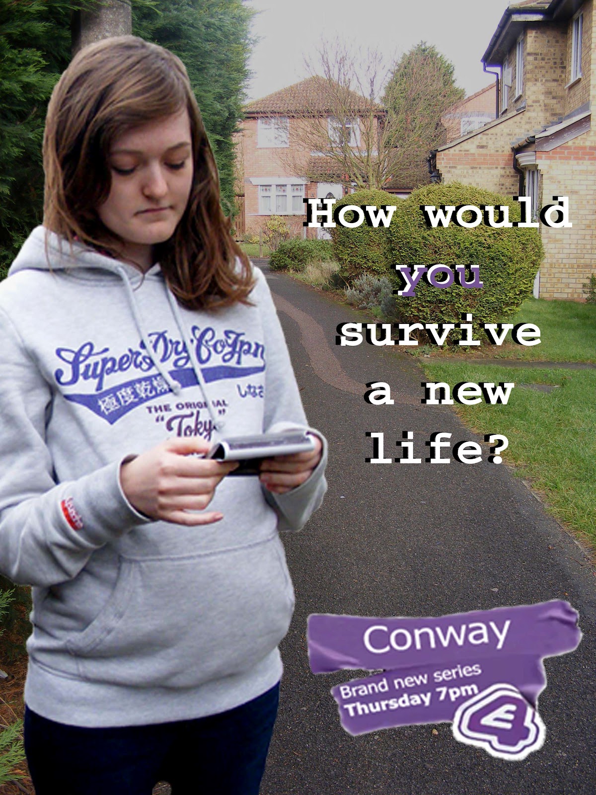
For our A2 coursework we planned and filmed a conventional soap trailer as well as our two ancillary texts; a poster and a television magazine front cover. We decided on the name ‘Conway’ for our soap, after getting inspiration from local road signs, as most soaps are named after and based on real places.  Our tag line, ‘How would you survive a new life’, reflects the fact that it is a new soap and promotes the idea of real life struggles and controversial story lines which our audience can relate to.  This tag line was also included on our posters, showing the use of synergy.
Our soap trailer starts out with the character playing a pregnant girl.  We used her at the beginning, as well as on our poster, as this makes the soap easily recognisable for the audience continuing the use of synergy.  We also used the male character, who biked past in the first and last scene, to create a connection between the characters and linking them together within the new area.
We chose the setting of the second scene to be a train station as one of our recurring theme was for people to be arriving at different destinations, as a way of a new start, and this synergy again promotes the idea of the soap being new.  The characters are stereotypical with teenage pregnancies and young mums at an all time high.  I focused on this controversial issue by making the image the main focus point of my magazine. 
In my poster I chose to use only one character as it reflects her isolation, as young mums can sometimes feel alone and not accepted within society.  My idea was that there would be more than one poster, with different characters, reflecting each individual story however I chose to create one with this character as I feel her storyline is particularly dramatic and relatable for the target audience as it is a contemporary issue. 
My poster is similar, with the background of the poster being dark and isolated, showing pathetic fallacy as the pregnant character looks upset. I included two other characters in the background as they weren’t the main focus, but I felt that their stories and issues were the most dramatic.
 We also addressed the issue of bisexuality, slowing down the pace of our footage at the crucial point of rejection, showing that it is something which is not always accepted within society.  Similarly, I used images of these characters in this contemporary situation because the storyline would be interesting to our target audience.  Originally we were planning to broadcast our trailer on BBC1 however; we changed to E4 as we felt that it was better suited because of our younger target audience.  To make our E4 logo look authentic to the channel we added a ‘wipe’ and ‘peel’ transition, which is something that is similarly used by E4 itself. 
At the end, we have the character Ricky, dressed in a stereotypical ‘hoody’ fashion, looking directly down the camera in a sinister and threatening way. This relates to our tag line ‘How would you survive a new life?’ as it is hinting at the audience that he will be causing trouble and making everyone else’s lives difficult.
We used a low angle shot, to emphasise the characters exit, once again relating to the new start.  Different shots are important for our magazine cover and poster as we need close ups of their faces to make them recognisable, and allows the characters to express their emotions for the audience to see. 
We both researched conventional television magazine front covers in order to make ours as realistic as possible, using a light blue background as to not distract any attention from the foreground images and text.  As well as our main image, we included other images of our characters as sub stories. ‘Playing it… straight?’ was the caption of the main story, and I believed this would be affective as it confronts a contemporary issue and is also word play for a popular television programme at the moment.
Throughout this project we have learnt how to effectively use soap conventions and believe this allowed us to be able to combine our soap trailer with our ancillary tasks through the use of synergy and relevant editing, creating a recognisable soap for our audience.

In what ways does your media product use, develop or challenge forms and conventions of real media products?

I took nine different screen shots of my soap trailer which I felt displayed the use of developing or challenging forms and conventions of a real media product.


1 - The first image displays our continuous use of synergy throughout the trailer as the male character on the bike appears in the beginning scene of the soap, biking past one of the other characters in the town.  This joins together all the other scenes, as he is then seen at the very end, showing that all the characters are in the same new area.  Synergy is a key convention of a real media product as it allows the audience to make clear connections.  This is why I used screen shots from our trailer for my poster as well as including one on my magazine front cover, as it easily allows the audience to identify the soap.

2 - In this photo you can see grandparents arriving at their new location with their granddaughter.  Although our target audience is that of the younger generations, we made sure there was also a variety of ages amongst our characters so that our soap could still appeal to different ages.  It is also important for a soap to have stereotypical characters to give the audience something to relate to as well as making the characters recognisable.

3 - As our trailer was advertising a brand new soap, we decided to have a 'new' theme running throughout, as shown in the screen grab.  'New life...' relates to the characters situation but also emphasises the fact that it is a new soap.  Although most soap trailers don't on screen include text, we decided that it was relevant to portray the continuous message throughout.  We also didn't want to use a blank screen between the footage for our text as we felt that it would break up our story line too much and that the footage wouldn't flow in the way that we wanted it to, as it went from the different locations of the characters.

4 - This forth image emphasises the fact that we wanted our trailer to be modern and exciting.  We helped to achieve this by using effects and transitions, such as the 'zoom and pan' shown in the screen grab.  Even though effects like this are not widely used within trailers, we wanted to challenge what is seen as a stereotypical trailer and make ours different in order to capture out target audience with something new and interesting.

5 - This image shows one of the settings we chose to film at, the train station.  In most soaps they use classic settings, such as the pub or market square, however we chose to use some more modern locations as well, to reflect our target audience.  By using real life locations around our own town, it allowed us to achieve a sense of realism within our trailer.  The use of different locations, but in the same town, was key to our trailer as it was about all the characters coming from different places and all wanting a new start for different reasons.  We tried to give a small insight into the characters reasons for wanting new starts, however didn't want to give too much away, but just enough to entice them into watching the soap.
  
6 - We ensured that a range of camera shots were used to make the trailer as visually interesting as possible as well as portraying the characters emotions to the audience.  This is something typical in trailers and they are short so must therefore catch the audiences interest as quickly as possible, however we tried to give ours more of a 'Hollyoaks' feel as we wanted it to be more quirky and less of a classic trailer, targeting our young adult/teenage audience.

7 - This photo shows a low angle shot and, as previously spoken about with photo number 2, shows our variety of camera work to make the trailer as attention grabbing as possible.  This shot also shows the audience the mise en scene, allowing them to get some more information about the particular character in the scene.  A shot like this is typically used in real media products as it is focusing on a key aspect of the action, the bag, showing the audience that it has a relevance to the storyline.  In this particular storyline it signifies the girl running away to a new start.  Being a low angle shot, it also gives the audience the view of looking down on the character, making them appear small and insignificant, reflecting the characters emotions and feelings.

8 - To make our soap relatable and modern we used controversial story lines for our characters, such as the young mum and baby in the screen grab.  This was because we wanted to make our soap exciting and 'now'. We also used a 'love triangle' situation, including a straight guy, lesbian, and another girl confused about her sexuality and feelings.  This kind of situation is something which many teens face, therefore would find interesting and be able to relate to it, as well as others being able to learn from it and possibly change their perspective of certain views they have on different current matters.

9 - In order to give our trailer a feeling of realism, we edited and used an E4 banner for the end, as this is something which E4 uses itself.  The channel logo is a key aspect of a trailer as it must be clearly advertised for the audience, otherwise they won't know which channel it's being broadcast on.

Wednesday, 7 March 2012

Television magazine front cover


To make my television magazine front cover as realistic looking as possible I ensured that I used all the typical conventions such as; the masthead in a bold red to allow the reader to easily see the title of the magazine, the dominant image to attract their interest and strap lines to give more information and an insight into what is inside the magazine.

For my title I used a free online text generator, in order to make it both visually interesting and stand out, attracting a potential buyers attention.  I chose a bold, rounded font, to give my magazine an appropriate fun, entertaining look, instead of a more serious broadsheet approach which would appeal to the wrong target audience.

I chose to use a light blue colour for the background of my cover as not to detract any attention away from the photographs and text.  This also made it easier for the masthead and other text to stand out.

The main image is a photograph of two characters from my soap trailer.  I chose to use the young mum and baby as I felt that this was one of the most controversial topics within the trailer due to young mums always being looked down on and never seen as good enough.  However the fact that the title states 'Amanda wants a better life for her and baby Charlie' shows that this stereotypically negative view is challenged as it appears as though she is aware her sons life but is now trying to do the best for him.  This will hopefully attract the audience into wanting to know more about the past, as well as the need to find out whether there is a positive outcome in their future.

I also included a bar code, date and website address to add to the realism, as well as advertising other programmes and a competition, both attracting potential buyers to my magazine over other competitors.

Monday, 5 March 2012

Poster background locations

I copied my character onto a variety of different location photos in order to decide which one looked best and reflected the mood and situation of the character.


I finally came to the conclusion that they were all too brightly lit and, as I wanted to project the isolated mood of the character, continued to search through photos we had taken, whilst on location, for another which I felt was more suited.

My soap posters

After finding some darker looking background photos I created a few different versions of my poster as I was still unsure on what photo to use.


I decided on a photo which was taken around the area where the characters scene was originally shot as.  This was because, although it wasn't as dark and gloomy as some of the others, it made it clear that the soap is set in a small town, as she is standing down an alley way with houses behind.


Thursday, 16 February 2012

Drawn plan of soap poster

I made a quick rough sketch of where I wanted everything to be, and what needed to be, on my poster.
  • Title - Conway
  • Tagline - How would you survive a new life?
  • Date and time -Thursday 7pm
  • Channel logo - E4
  • Character/s -Pregnant teenage girl (and?)
  • Official website address -for added information
  • The word 'new' -to inform entice the audience

Research: Soap posters

Soap posters are there to inform the public of a completely brand new or new series, giving them the time, date and channel but also an small insight into what it will be like using characters and mise en scene.  The information is kept short and simple, as posters are viewed quickly and the images 


This poster in particular is almost highlighting to the public the fact that Hollyoaks is different to a typically conventional soap, with clubs instead of pubs, aiming to target a younger audience.  The characters are young and glamorous looking in the right image, unlike the left.


Although skins is a drama, not a soap, its posters are good examples as they are aimed at the target audience which our soap is aimed at.  Both posters are about partying, mischief and having fun, representing a typical teenagers life.